A heavy, oval-shaped wooden palette dominates the foreground, its surface curated with deliberate color strings transitioning smoothly from pure pigment to subtle neutralized tones. Each dab of oil paint has a velvety, buttery sheen, reflecting tiny points of warm studio light. Beneath the palette lies a slate-grey tabletop with a single, pristine palette knife resting diagonally, its metal blade catching a sharp highlight along the edge. The background reveals an out-of-focus arrangement of glass jars filled with linseed oil, turpentine, and refined mediums on a dark walnut shelf. Dramatic, cinematic side lighting from an unseen lamp creates a chiaroscuro effect, emphasizing the tactile richness of the paint. Shot from a slightly elevated angle with the palette centered but framed by negative space, the composition feels controlled, intentional, and quietly luxurious, evoking the mindset of a master color mixer.

Color Mastery

Learn a proven palette system that removes guesswork from mixing luminous, repeatable oil colors.

About

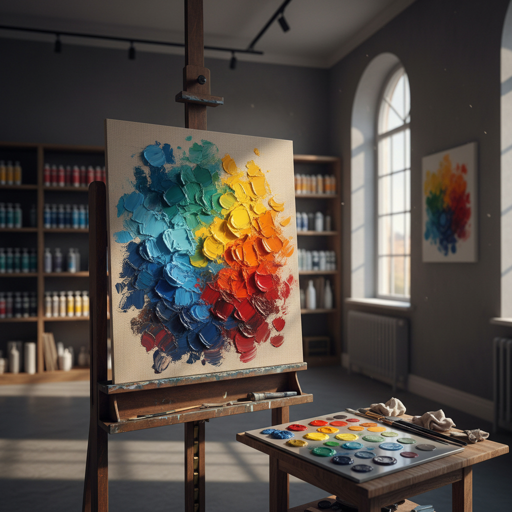
Inside The Oil Painter’s Studio

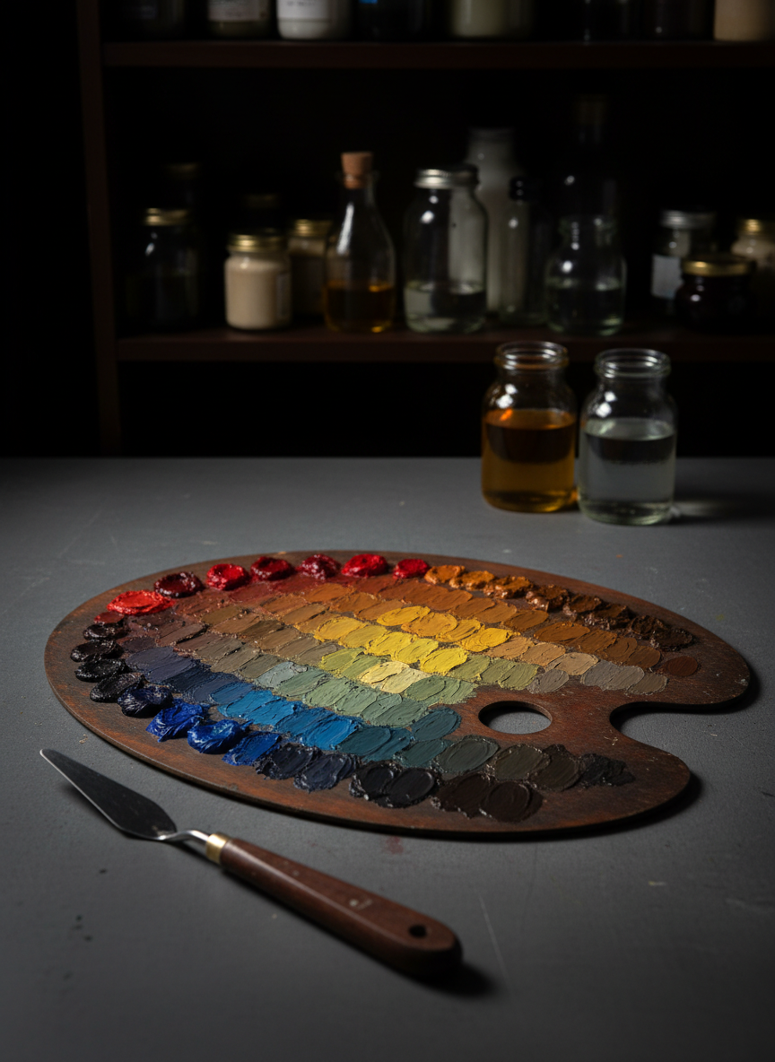
Trained in traditional atelier methods and inspired by Impressionist color, I developed a structured palette approach that maps mixtures, simplifies choices, and gives painters reliable, luminous results on any subject.

A polished mahogany workbench displays an open, leather-bound color notebook beside a segmented wooden box of premium oil paint tubes, arranged by temperature from coolest blues to warmest reds. On the notebook page, carefully painted oil swatches step through controlled value shifts of a single hue, annotated with precise medium ratios. A small, circular glass palette nearby holds nuanced, pre-mixed skin-tone neutrals, each mound of paint with a soft, satiny gleam. Cool, indirect studio lighting from overhead panels creates even illumination with gentle, cinematic falloff at the frame’s edges, preserving subtle color relationships without harsh shadows. Shot at a three-quarter angle with the notebook placed along the lower third, the depth of field keeps every note and swatch legible while the background—shelves of archived sketchbooks and color wheels—softly blurs. The mood is scholarly, disciplined, and unmistakably sophisticated, celebrating methodical color study.

Testimonials

A close-up view of a meticulously organized color chart on heavy, deckled-edge paper, each square painted with oil mixtures ranging from vibrant complementary contrasts to perfectly calibrated greys. Handwritten pigment names and ratios in crisp, dark ink line the margins, adding a scholarly precision. The chart rests on a deep, espresso-colored drafting table, with an antique brass desk lamp arcing overhead. The lamp casts a warm, focused pool of light that reveals the subtle gloss of drying oil and the paper’s toothy texture, while the surrounding studio falls into soft shadow. Captured from a slightly oblique, cinematic angle, the frame uses the rule of thirds, letting the chart dominate while blurred glass bottles and an old wooden color wheel sit in the background. The mood is intellectual, refined, and quietly obsessive about color accuracy.

Hope D.

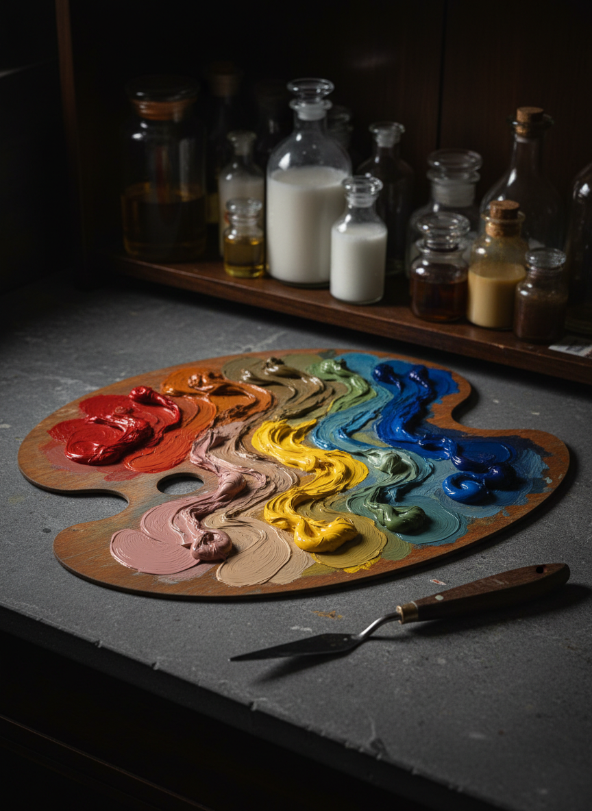
These lessons finally demystified mixing clean color; my palettes are faster, richer, and far less muddy.

A richly stained wooden easel holds a large linen canvas, half-covered in harmoniously blended oil swatches—from cool ultramarine blues to warm cadmium oranges, each stroke thick with impasto texture. At the base, an organized glass palette displays neatly arranged pools of primary and secondary colors, each subtly mixed into precise gradients. The scene is set in an elegant, high-ceilinged studio with muted charcoal walls and floor-to-ceiling shelves of neatly labeled paint tubes. Late afternoon light pours through a tall window, casting cinematic, directional beams that skim across the wet paint, creating glistening highlights and soft, elongated shadows. Captured at eye level with a shallow depth of field that keeps the canvas and palette in crisp focus while the background fades into a refined blur, the atmosphere feels sophisticated, contemplative, and impeccably professional.

Hope D.

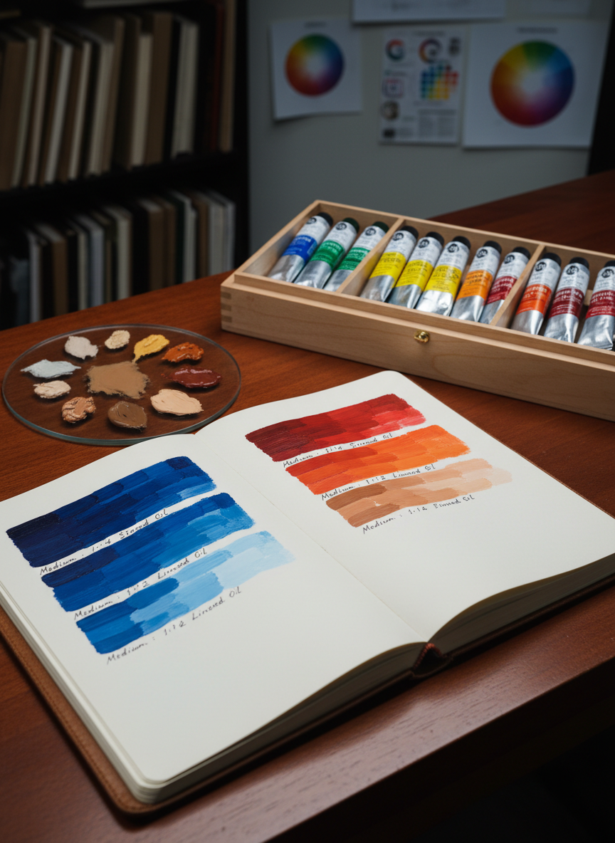
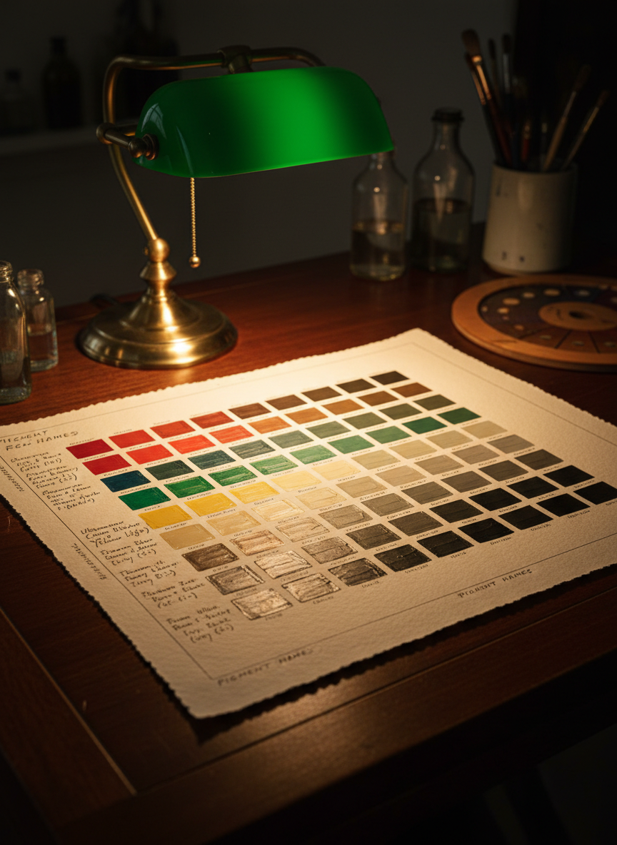
The clear, step-by-step charts turned intimidating theory into practical tools I use every time I approach a canvas.

A richly stained wooden easel holds a large linen canvas, half-covered in harmoniously blended oil swatches—from cool ultramarine blues to warm cadmium oranges, each stroke thick with impasto texture. At the base, an organized glass palette displays neatly arranged pools of primary and secondary colors, each subtly mixed into precise gradients. The scene is set in an elegant, high-ceilinged studio with muted charcoal walls and floor-to-ceiling shelves of neatly labeled paint tubes. Late afternoon light pours through a tall window, casting cinematic, directional beams that skim across the wet paint, creating glistening highlights and soft, elongated shadows. Captured at eye level with a shallow depth of field that keeps the canvas and palette in crisp focus while the background fades into a refined blur, the atmosphere feels sophisticated, contemplative, and impeccably professional.

Hope D.

As a realist painter, accurate skin tones were a struggle until this system showed exactly which pigments to reach for.

A heavy, oval-shaped wooden palette dominates the foreground, its surface curated with deliberate color strings transitioning smoothly from pure pigment to subtle neutralized tones. Each dab of oil paint has a velvety, buttery sheen, reflecting tiny points of warm studio light. Beneath the palette lies a slate-grey tabletop with a single, pristine palette knife resting diagonally, its metal blade catching a sharp highlight along the edge. The background reveals an out-of-focus arrangement of glass jars filled with linseed oil, turpentine, and refined mediums on a dark walnut shelf. Dramatic, cinematic side lighting from an unseen lamp creates a chiaroscuro effect, emphasizing the tactile richness of the paint. Shot from a slightly elevated angle with the palette centered but framed by negative space, the composition feels controlled, intentional, and quietly luxurious, evoking the mindset of a master color mixer.

Hope D.

I collect oils, and the nuanced, harmonious color relationships in this work immediately stood out as masterfully controlled.

Contact Studio

Reach out to discuss commissions, workshops, speaking engagements, or collaborations with The Oil Painter’s Studio.

← Back

Thank you for your response. ✨